Month Over Month (MOM)
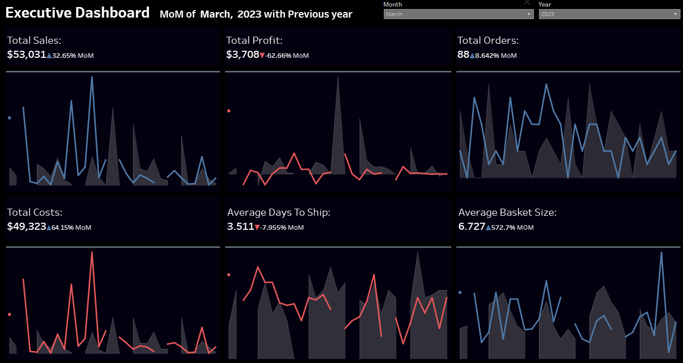
Making Month over Month line charts to check the progress of different fields and making comparisons
With my experience in Data Analysis Field complemented by an ITI graduate background and a bachelor's degree in Statistics
Making Month over Month line charts to check the progress of different fields and making comparisons

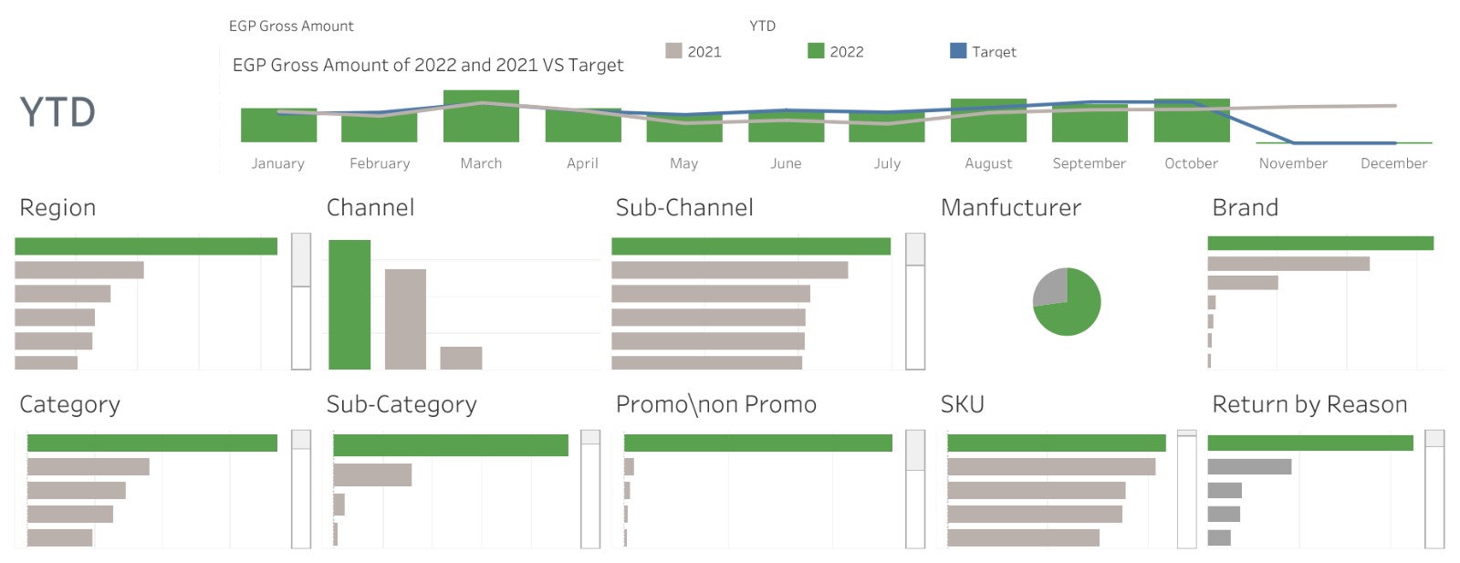
Dashboard for food company
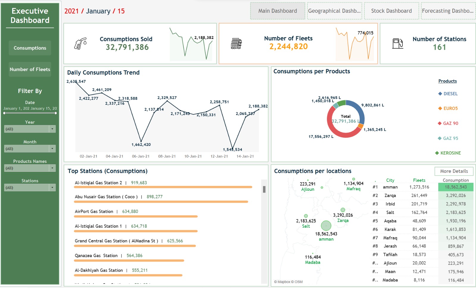
Dashboard for petrol company after extracting data and cleaning it in tableau prep
Extract the world cup data from the tables exist on the Wikipedia website: https://en.wikipedia.org/wiki/FIFA_World_Cup Profile and clean the data and do the proper ETL and load the data
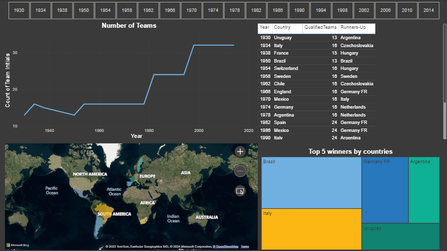
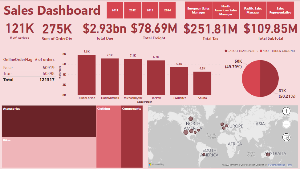
Get the required data and import it in power bi using Direct Query then Model the Data into Star Schema
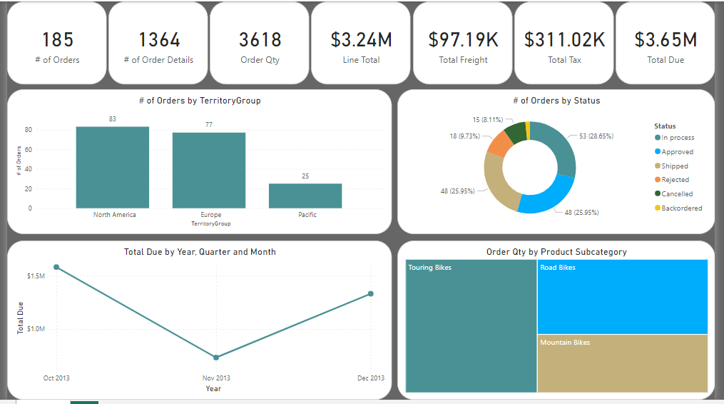
Extract the Data from the excel spreadsheet and model it “Star Schema”.
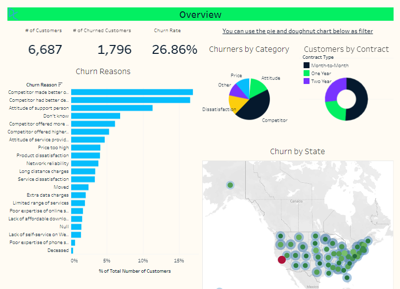
Churn analysis is an ongoing process, and leveraging Tableau's powerful visualization capabilities enhances the depth and effectiveness of such analyses.
The insights gained from this analysis at DataCamp can inform strategic decisions aimed at improving user retention and overall platform success
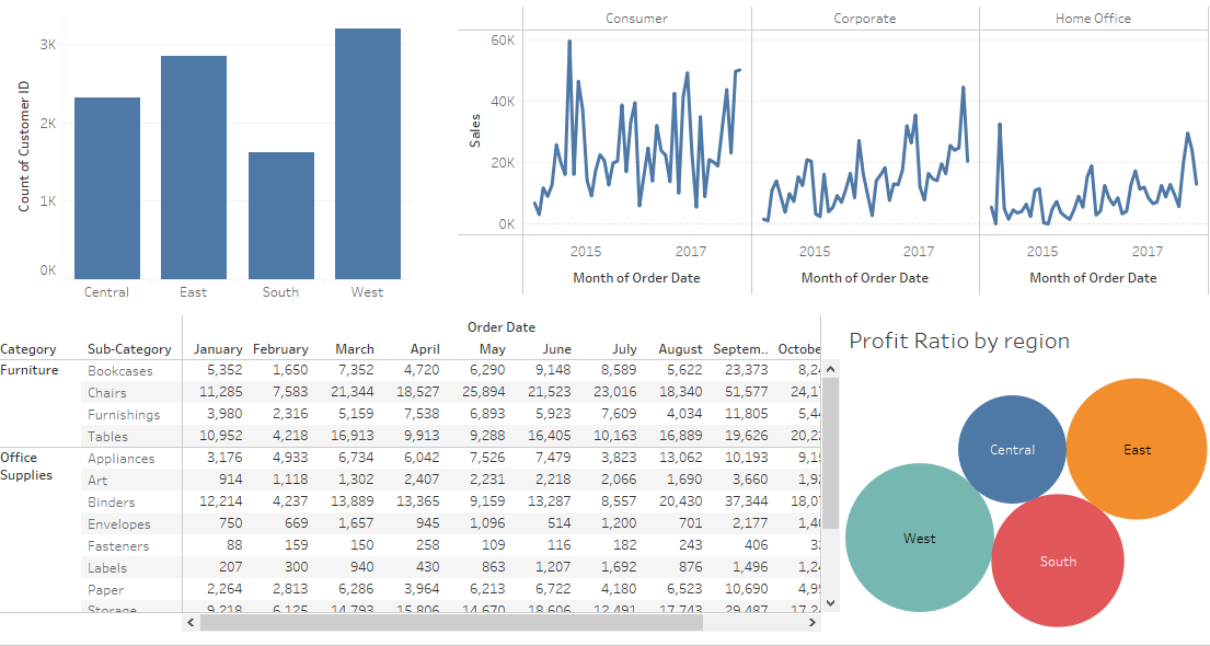
Sales and profit by customer report
Sales forecast report
Product dashboard includes • Sales by product category • Sales and profit by product name • Sales by region and state
Waterfall chart report for sales and subcategory
Use Lollipop chart to clarify category and sales
Compare Three Categories using chart
Overview dashboard includes • Monthly sales by segment • Count customer by region • Profit Ratio by region • Order details
Giza, Egypt